Wednesday 29 December 2010

Topshop are swept up in a snow storm


The sheer size of this giant snow globe in Topshop's flagship store was enough alone to grab my attention. As I stopped to look at it amongst the flurry of Christmas shoppers on Oxford street, I admired the giant snow globe set amongst a scene of frosty and glamorous mannequins and props. I like the way everything from the mannequins white afro's, to their embellished evening dresses and fur accessories emanates the frosty theme. Positioned amongst a backdrop of silver and white sprayed shards of metal. This instantly recognisable ornament is represented in a larger than life size full of Christmas sparkle and glamour.

Sunday 21 November 2010

We three kings of Orient are


Christmas has landed and I thought I'd kick off with this gorgeous scheme from Vivienne Westwood. The quintessentially British fashion house has used the three kings characters from the nativity story as the inspiration for their Christmas window displays in their menswear store (see first photo) and their ladies store (see second window.)

The rich tones of coppers, reds and golds emanate grandeur and royalty, while the use of three mannequins and mock crowns help to establish the theme of the display. I love this simple concept, that with clever spotlighting, really shows off the fabulous Vivienne Westwood signature tartans and elaborate prints.

Thursday 18 November 2010

Back to the drawing board for Moschino


I really like this display at Moschino, their white space just off New Bond St is the perfect setting for a colourful and playful display. The oversized objects really stand out as you walk past the store and the attention to detail, including the moschino logo printed on the pencils draw you in further. The symmetry in the display created by the two groups of pencils and the limited colour pallette makes this window pop!

Sunday 31 October 2010

Chanel's icy exterior


This icy display at Chanel is the perfect winter window and is bang on trend with some of this seasons key pieces including fur accessories and the leather shearling jacket. The darker tones of the clothing really stand out against the white and icy blue backdrop of the display. They have kept the composition simple and elegant, embodying the brands image perfectly.

Wednesday 29 September 2010

Harvey Nichols are switched on


I love these menswear windows at Harvey Nichols in London's Knightsbridge. The very male range of electrical objects including a toaster, headphones and a tv, are created in a illustrative style using different colour wires and bright lighting.

I think the composition of these windows is really strong, with the wire installation in the middle with a mannequin at one side and a range of clothing and accessories hanging off the wire on the other.

I really like the way the coloured wires are plugged into the sockets that are stark white along with the backdrop, making the primary colours of the wires and products stand out.

Sunday 26 September 2010

Black and white is best at Cos and Topshop


The stark visual contrast and impact of a completely monochrome display works really well here for Topshop, in the first two images and Cos, in the third image. In order for such a simple concept to be successful the composition of the props and clothing/accessories has to be carefully thought out. What both brands have done is used the height of the window display to products at different levels. Topshop's stacked and balanced props are busier and more compact than Cos's minimalist chairs, stools and rails, but I think both approaches have a really strong look and work well for their brands.

Friday 24 September 2010

Anthropologie Set Sail


Anthropologie was one of the first brands that I posted about on this blog, and I'm happy to see that their displays a year on are as strong as ever. These nautical inspired windows have an authentic, rustic feel that is Anthropologie down to the ground. This is created by the worn, faded tones of blues, greys and greens and the handmade looking materials used for the props. I really like the composition of the displays in these windows, in particular the symmetry between the sails and the mannequins in the first image.

Sunday 22 August 2010

Selfridges wish, crave and lust over the new seasons key pieces


It's one of the most exciting times of the year in the fashion retail industry, the summer and the sales are drawing to a close and the Autumun/Winter collections are being stocked up and sprawled all over the fashion magazines. Key trends and pieces are predicted as consumers are told how they can update their wardrobes with the "must-haves" of the new season.


My interpretation of this series of windows from Selfridges is that the creative team have tapped into this and created a visual display that shows consumers a wishlist for the new season. Whether they crave, obsess or lust over, at this time of year consumers choose the new jacket, the perfect cocktail dress and the fabulous new handbag they must have this season!

Each window features one emotion and one key piece, making it easy for consumers to focus in on each product as they walk down Oxford Street. The key pieces in the scheme show what the department store do best; housing the most innovative, relevant and iconic designers of the moment and help stamp their authority within the industry.

Sunday 15 August 2010

Gap Kids and H&M battle it out in the classroom


Gap Kids and H&M are tapping into the Back to School trend for their childrenswear departments in a big way. Both brands have used props of giant stationary including sharpeners, erasers and rulers to create fun, colourful displays. Gap Kids have used bright primary colours and cardboard for their props whilst H&M have used a broader range of materials to create more lifelike versions of the stationary.

The compositions of the two displays are determined by the scale of the windows, as H&Ms much bigger and wider window of their Regent Street store allows the brand to spread out the props. Compared to Gap Kids much smaller window at their Oxford Circus store, where the stationary and mannequins are much more compact. I think the composition of Gap's window display is much more eyecatching and the closeness of all the props reminded me of a childs stationary crammed into a pencil case.

Wednesday 11 August 2010

Melting Moschino


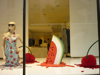
These windows at Moschino are the perfect summer display. I love the way the giant fruit, icecream and the mannequin are all melting, presumably from the heat of the summer sun, creating splashes and puddles below them. This simple concept works for me because of the contrast of the bold colours and soft fabrics of the props against a stark white backdrop. The strong lighting used also helps to give the impression of the heat and brightness of the sun on a scorching summers day.

Saturday 7 August 2010

Designers get taught a lesson by Selfridges


August has arrived and at this time every year this spells out three words for retailers "Back to School". Here Selfridges have cleverly used references to days at school including apples, books, and knee high socks to create a quirky and rather grown up display for the womenswear department.
I always think attention to detail is what makes a visual display work and here is no exception. The carefully placed apple on the mannequins head and the freckles on their cheeks are both examples of this. One element of the display that I thought was particularly clever was the way they have shown which designers clothes are used for each mannequin by writing it in letters on their arms and legs. Something my school friends and I certainly did when the teachers weren't looking!

Tuesday 29 June 2010

Louis Vuitton travel in style to the Eiffel Tower


Even on holiday I can't resist a peak at the windows of the worlds most prestigious fashion designers stores! This display caught my eye in Munich, Germany where I visited a couple of weekends ago with a group of friends.

I love the way the brand have taken one of France's most famous landmarks the Eiffel Tower, and created a really fun, building block style model out of mock pieces of luggage. This display uses a range of summer themes such as travel, luggage and tourism to create a playful yet sophisticated display. The limited colour palette and symmetrical composition of the three components: the model, the drawing and the mannequin, create the level of sophistication that is required for the premium brand.

Friday 25 June 2010

Hanging out at Whistles


I have done a few posts about the use of giant letters in retailers window displays, discovering that it is quite a big trend in Visual Merchandising. I like this display by Whistles because unlike the other displays such as Stella McCartney at Liberty and Burberry where the letters were placed on the floor, at Whistles the letters hang from the ceiling. By hanging the neutral tone letters from wires they are able to use the height of the window and draw the customers eye across the store.

Monday 21 June 2010

Fred Perry enjoy the beautful game


The Football World Cup is one of the biggest events this summer so its not surprising that brands have tapped into the tournament for visual merchandising inspiration. I love this window display in Fred Perry's Nottingham store because although it is a strong association with football, the display is subtle and clever and in line with the heritage brand's identity.

The oversized table football players are instantly recognizable and a fun play on size, as table football itself is a miniature form of the sport yet here it is a giant version of it. I particularly like the way the "footballers" are wearing Fred Perry's signature polo shirt which is famous to the brand.

Sunday 13 June 2010

Jigsaw's Sweet Tooth


I have blogged about Jigsaw's window displays a number of times and this scheme is perhaps my favorite so far. The womenswear high street brand have used props of oversized sweets to create a bright, fun and eye-catching display. The giant gum balls, sticks of rock, lolly pops and pick and mix striped bag, are all instantly recognizable because of their shapes, textures and colour. Their timeless nature has an element of nostalgia as the sweets are favorites amongst generations including the middle aged demographic that the brand is targeting.

The display takes an instantly recognisable theme and reproducess it in a giant form to catch the eye of passers by and create a visual impact.

Monday 3 May 2010

Harvey Nichols are all tied up


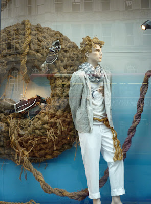
These images are of Harvey Nichols menswear window displays, photographed on Friday at their Knightsbridge store. The nautical theme that has appeared in various Visual Merchandising schemes in the last few summers, offers a range of motifs to play with including anchors, ropes, seagulls and stripes. What I like about Harvey Nichols interpretation of the theme is the way they have focused on one key prop and played with it in a number of ways.

An element to these displays that I particularly like is the way that accessories such as shoes and hats have been tied up and placed in the circular rope on the backdrop in the window. With only one mannequin in each window it allows the store to showcase more products in a playful way. Another feature that works really well is the use of rope for the mannquins hair, styled in a fairly realistic way it is a subtle addition to this playful display.

Saturday 1 May 2010

Trend Spot: Flamingos


Over the last month or so I have spotted a number of flamingos within window displays of various retailers. The first example I have shown is of Harrods, this particular pink bird featured in their Alice in Wonderland display. This trend I have noticed undoubtedly is linked to the Alice in Wonderland theme popular in March, as in the story Alice plays croquet with some flamingos.

The River Island display shown in the last two images mimics the bright coral/pink of the flamingos in two dresses modeled on the mannequins. I like the way in this display the two birds are doing different poses adding interest to the props. The bright colour of the bird makes it an ideal prop for Spring/Summer and the Alice in Wonderland link strengthens its relevance this season.

Thursday 22 April 2010

Printemps discover Alice and her Wonderland


Images Sourced at WGSN

Last month I did a post about the trend of Alice in Wonderland in Visual Merchandising, inspired by the Tim Burton and Disney collaborative film release. These images of Printemps windows in Paris show another brands interpretation of the trend.

In contrast to Selfridges and Harrods, Printemps display is very uncluttered and clean, dominated by the mostly monotone colour palette. The store have used three devices to communicate the trend. Firstly the backdrops are all black and white stills from the film. Secondly the outfits modelled by the white rabbit mannequins are inpspired by the costumes. And thirdly the oversized props of iconic Alice in Wonderland motifs including teacups, playing cards and a pocket watch.

This sophisticated yet playful display shows how brands can take a strong and identifiable theme and produce a range of different schemes from it. Maintaining true to the theme whilst portraying their own image and selling points.

Monday 19 April 2010

Game, Set and Match to Ralph Lauren


Images Sourced at WGSN

I love the collaboration of the Wimbledon Tennis Championships and Polo Ralph Lauren so when I discovered this window display from their flagship store in the WGSN archives I had to share it. The collaboration is a perfect fit, with both parties evoking strong notions of lifestyle, class and high society.

The choice of props create an authentic representation of the all England club; the freshly pressed towels, competition silverware, picnic baskets and signposts to name a few. This display brings heritage and British tradition to a premium American lifestyle brand in a charming and sophisticated way.