Sunday 22 August 2010

Selfridges wish, crave and lust over the new seasons key pieces


It's one of the most exciting times of the year in the fashion retail industry, the summer and the sales are drawing to a close and the Autumun/Winter collections are being stocked up and sprawled all over the fashion magazines. Key trends and pieces are predicted as consumers are told how they can update their wardrobes with the "must-haves" of the new season.


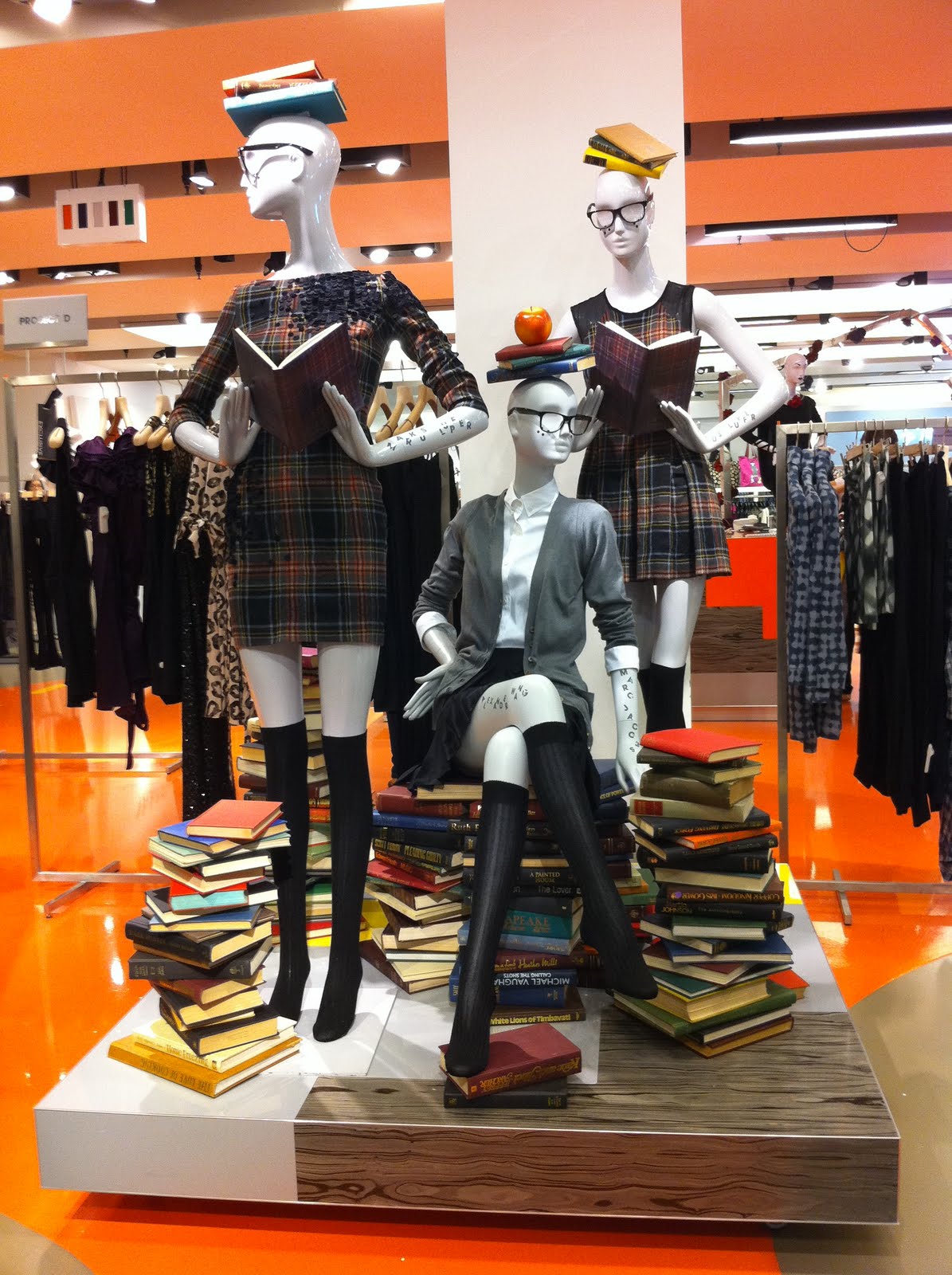
My interpretation of this series of windows from Selfridges is that the creative team have tapped into this and created a visual display that shows consumers a wishlist for the new season. Whether they crave, obsess or lust over, at this time of year consumers choose the new jacket, the perfect cocktail dress and the fabulous new handbag they must have this season!

Each window features one emotion and one key piece, making it easy for consumers to focus in on each product as they walk down Oxford Street. The key pieces in the scheme show what the department store do best; housing the most innovative, relevant and iconic designers of the moment and help stamp their authority within the industry.

Sunday 15 August 2010

Gap Kids and H&M battle it out in the classroom


Gap Kids and H&M are tapping into the Back to School trend for their childrenswear departments in a big way. Both brands have used props of giant stationary including sharpeners, erasers and rulers to create fun, colourful displays. Gap Kids have used bright primary colours and cardboard for their props whilst H&M have used a broader range of materials to create more lifelike versions of the stationary.

The compositions of the two displays are determined by the scale of the windows, as H&Ms much bigger and wider window of their Regent Street store allows the brand to spread out the props. Compared to Gap Kids much smaller window at their Oxford Circus store, where the stationary and mannequins are much more compact. I think the composition of Gap's window display is much more eyecatching and the closeness of all the props reminded me of a childs stationary crammed into a pencil case.

Wednesday 11 August 2010

Melting Moschino


These windows at Moschino are the perfect summer display. I love the way the giant fruit, icecream and the mannequin are all melting, presumably from the heat of the summer sun, creating splashes and puddles below them. This simple concept works for me because of the contrast of the bold colours and soft fabrics of the props against a stark white backdrop. The strong lighting used also helps to give the impression of the heat and brightness of the sun on a scorching summers day.

Saturday 7 August 2010

Designers get taught a lesson by Selfridges


August has arrived and at this time every year this spells out three words for retailers "Back to School". Here Selfridges have cleverly used references to days at school including apples, books, and knee high socks to create a quirky and rather grown up display for the womenswear department.
I always think attention to detail is what makes a visual display work and here is no exception. The carefully placed apple on the mannequins head and the freckles on their cheeks are both examples of this. One element of the display that I thought was particularly clever was the way they have shown which designers clothes are used for each mannequin by writing it in letters on their arms and legs. Something my school friends and I certainly did when the teachers weren't looking!