Friday 18 November 2011

Selfridges are dreaming of a white Christmas


Christmas has officially arrived in retail and what better way to kick off the festive season here than with Selfridges. This year Selfridges have gone for a white winter Christmas theme, each of their windows depicting a Christmas related scene in a wash of white and silver sparkle. The attention to detail, use of scale, texture and lighting are what makes the all white display a success and looks particularly stunning at night. If you havn't been yet definitely get down to Oxford Street and feast your festive eyes on this gorgeous display! From cute polar bears to silver sequin stilettos there is something for everyone!

Wednesday 28 September 2011

Topshop reflects the high street


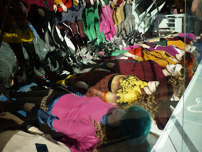
I absolutely love this window in Topshop's Oxford Street Flagship store and under the beautiful clear blue skies of London today the reflective design looked incredible. A very simple concept, the window was made up of a row of mannequins on the floor styled in this seasons autumnal colours of magenta, mustard and oxblood. The mannequins on the floor were reflected in the mirrored surface of the backdrop so that to the passer by (or blogger in my case) you can see them perfectly as if they were stood up like in any other window..
As a brand that is ahead of the pack in delivering fashion to the high street it is great to see a creative concept that reflects (excuse the pun..) this.

Sunday 11 September 2011

French Connection is the product


French Connection state on their website..


"Going forward we will present French Connection as a credible and focused fashion brand that speaks through its product."


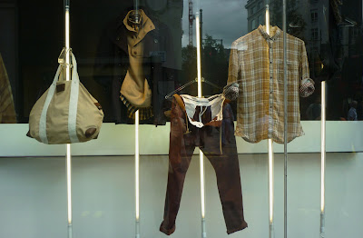
This campaign does exactly that! In a tough economic climate it is more important than ever that retailers focus on having the right product for their customer. This campaign for French Connection is fantastic, especially with this in mind. It communicates to the customer about their product in a direct, humorous and visually exciting way.
I love the visual presentation of this campaign with the product displayed on tube shaped lights that extend from the floor to the ceiling of the window. Without the detail and composition of mannequins it strips the display back and keeps your eye focused on the product. The text is a short one liner slogan simialr to those of French Connections previous two campaigns.. (Scroll down to February post to re-jog your memory!) I like the way they have used a similar format from previous campaigns and given it a new spin, making it instantly recognisable to the brand. I just hope they don't get too comfortable but continue to bring out new ideas that surprise and excite the customer!

Wednesday 27 July 2011

John Lewis spell it out


This set of windows at department store John Lewis is a really strong example of how text can can be used with merchandise to create a clear and visually exciting message. By using a range of products to help write each word for the relevant department, for example 'dine' for their china and glass department, they add humour and interest to an otherwise very minimalistic display. By keeping the colour palette to mainly black and white they allow the text and products to create the impact. Informing passers by of the departments and products available in John Lewis!

Sunday 29 May 2011

Bright Lights at Kurt Geiger


Kurt Geiger have taken this seasons neon brights and created a simple yet high impact display that draws your eye to another collection of their amazing shoes. Faced with one of the hardest types of product to merchandise in my opinion, Kurt Geiger have created a scheme that is very bold with the contrast of neon brights and stark white whilst maintaining a slick feel that embodies the brands image. I love this scheme and think it is the perfect display for this season.

Saturday 30 April 2011

A Right Royal Do!

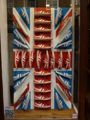
The most eligable man in England has tied the knot in what I thought was a fabulously traditional yet intimate ceremony yesterday. Wedding fever has swept across London over the last few weeks, and it seems like everyone is taking part in the celebrations! Here are my favorite windows dedicated to the royal wedding. In order of the photos, the stores are Liberty, Oasis, Urban Outfitters, Gola and John Lewis.


This was my contribution to our royal wedding meal, (they are meant to form a Union Jack..)

Saturday 5 March 2011

Match Point to Tommy Hilfiger


The bright yellow and the sheer giganticness of the tennis ball caught my eye at Tommy Hilfiger on Regent Street this afternoon. The all-American brand have used the ever popular connotation of the country club lifestyle, more specifically tennis, to create a fun and eye catching display.

While I think the window display is striking, what I think works particularly well in this scheme is how the brand has carried the concept throughout the whole store. (Which is something I don't think brands do enough in visual merchandising!) The second photograph is one example of how they did this by using old fashioned rackets and a range of multi-coloured tennis balls on a shelf above a rail of clothing. Another example, which I couldn't photograph because of the number of staff stood around was a table tennis table complete with net being used to display a range of piled up polo shirts!

Wednesday 2 February 2011

French Connection ask if you are man?


Following the success of their 'The Man' and 'The Woman' campaigns last year, French Connection have splashed out this Spring on a new campaign titled 'You are man? and 'You are woman?' The campaign plays with connotations of what it means to be a man and what it means to be a woman.

These images are of one of the store windows that French Connection have launched as a part of this campaign. This display asks men are you man? using the scenario of a man riding an inflatable, not the most masculine of activities! Fun and humour is created by inflatable water and cloud props and of course the male mannequins styling of comical moustaches, speedos and inflatable animals.

I really like the way the brand has covered the entire side of their store with a giant graphic with a big cutout for the window display. Using an image from their print campaign makes the store instantly recognisable as French Connection and creates a coherent message across the different forms of promotion. The combination of the large scale photography, powerful text and humorous props creates a big impact and is hard to miss along the hustle and bustle of London's Oxford Street.

Sunday 23 January 2011

Spring is blossoming at Mulberry


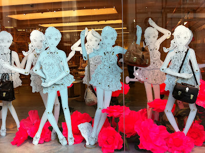
Amongst the doom and gloom of January it was really refreshing to come across this vibrant display at Mulberry. The white cut out dolls allow both the giant pink flowers and Mulberry's spring collection, including the much talked about Tillie bag to stand out.
Part of the strength of this display in my opinion, is the way it ties in with their current print advertising campaign, full of pink hydrangeas, wheel barrows and watering cans: all things Spring!

Wednesday 19 January 2011

The best of the sales


After my last post about the White Company I decided to see if I could track down anymore window displays that have used innovation and creativity in their promotion of that four letter word. It was by no means an easy task but eventually I found three displays that impressed me.

The first is Kurt Geiger on Regent Street, I really like the way they have used highlights of red in a subtle and stylish way; in their light bulb signage, in the shoes on display and also in the lips of the otherwise very plain mannequin.
The second display at Anthropologie also on Regent Street, uses playful fonts and patterns to create a composition of key messages about their sale. The third retailer pictured is Vivienne Westwood's menswear store just off New Bond Street. Refreshingly this brand decided to abandon the colour red and use the same vibrant blue as their store signage for their sale promotion. The bunched up giant letters are instantly eyecatching and work well next to the two mannequins, creating a balanced composition that fits the small but perfectly shaped window.

Sunday 9 January 2011

The White Company reduce their prices without reducing their image


Sales are the one time when retailers tend to strip back displays to just simple graphics, often using a combination of large lettering and the colour red! So I was really impressed when I spotted this display at The White Company at Sloane Square. The upmarket brand have successfully created a display that clearly communicates their sale but in a way that stays true to their strong brand identity. Proving that even though they are discounting their prices, by no means does it mean their upmarket signature style is impacted.

Using mannequins, examples from their product range and giant scripted lettering, all in their signature white, the brand create an elegant and effective scheme. The element to the display that allows it to be a success in my opinion, is the lighting. By positioning spotlights over the letters they prevent the all white display from looking bland and allow the word 'sale' to pop out.