skip to main |
skip to sidebar

 The bright yellow and the sheer giganticness of the tennis ball caught my eye at Tommy Hilfiger on Regent Street this afternoon. The all-American brand have used the ever popular connotation of the country club lifestyle, more specifically tennis, to create a fun and eye catching display.
While I think the window display is striking, what I think works particularly well in this scheme is how the brand has carried the concept throughout the whole store. (Which is something I don't think brands do enough in visual merchandising!) The second photograph is one example of how they did this by using old fashioned rackets and a range of multi-coloured tennis balls on a shelf above a rail of clothing. Another example, which I couldn't photograph because of the number of staff stood around was a table tennis table complete with net being used to display a range of piled up polo shirts!

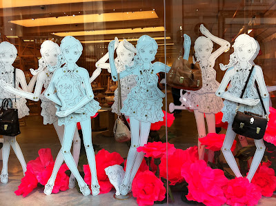 Amongst the doom and gloom of January it was really refreshing to come across this vibrant display at Mulberry. The white cut out dolls allow both the giant pink flowers and Mulberry's spring collection, including the much talked about Tillie bag to stand out.
Part of the strength of this display in my opinion, is the way it ties in with their current print advertising campaign, full of pink hydrangeas, wheel barrows and watering cans: all things Spring!
 Sales are the one time when retailers tend to strip back displays to just simple graphics, often using a combination of large lettering and the colour red! So I was really impressed when I spotted this display at The White Company at Sloane Square. The upmarket brand have successfully created a display that clearly communicates their sale but in a way that stays true to their strong brand identity. Proving that even though they are discounting their prices, by no means does it mean their upmarket signature style is impacted.
Using mannequins, examples from their product range and giant scripted lettering, all in their signature white, the brand create an elegant and effective scheme. The element to the display that allows it to be a success in my opinion, is the lighting. By positioning spotlights over the letters they prevent the all white display from looking bland and allow the word 'sale' to pop out.

 Christmas has landed and I thought I'd kick off with this gorgeous scheme from Vivienne Westwood
.
The quintessentially British fashion house has used the three kings characters from the nativity story as the inspiration for their Christmas window displays in their menswear store (see first photo) and their ladies store (see second window.)
The rich tones of coppers, reds and golds emanate grandeur and royalty, while the use of three mannequins and mock crowns help to establish the theme of the display. I love this simple concept, that with clever spotlighting, really shows off the fabulous Vivienne Westwood signature tartans and elaborate prints.


