Thursday, 16 February 2012

Mulberry are the flavour of the month


It may be ten below in London but that doesn't stop this display on Brompton Road look any less appealing! This summer inspired candy campaign from the British brand is right on the mark with this seasons candy colours and fun approach. The attention to detail on the giant icecreams is what prevents this campaign from looking cheap and tacky, the hundreds and thousands are my personal favourite, they look good enough to eat!

Friday, 18 November 2011

Selfridges are dreaming of a white Christmas


Christmas has officially arrived in retail and what better way to kick off the festive season here than with Selfridges. This year Selfridges have gone for a white winter Christmas theme, each of their windows depicting a Christmas related scene in a wash of white and silver sparkle. The attention to detail, use of scale, texture and lighting are what makes the all white display a success and looks particularly stunning at night. If you havn't been yet definitely get down to Oxford Street and feast your festive eyes on this gorgeous display! From cute polar bears to silver sequin stilettos there is something for everyone!

Wednesday, 28 September 2011

Topshop reflects the high street


I absolutely love this window in Topshop's Oxford Street Flagship store and under the beautiful clear blue skies of London today the reflective design looked incredible. A very simple concept, the window was made up of a row of mannequins on the floor styled in this seasons autumnal colours of magenta, mustard and oxblood. The mannequins on the floor were reflected in the mirrored surface of the backdrop so that to the passer by (or blogger in my case) you can see them perfectly as if they were stood up like in any other window..
As a brand that is ahead of the pack in delivering fashion to the high street it is great to see a creative concept that reflects (excuse the pun..) this.

Sunday, 11 September 2011

French Connection is the product


French Connection state on their website..


"Going forward we will present French Connection as a credible and focused fashion brand that speaks through its product."


This campaign does exactly that! In a tough economic climate it is more important than ever that retailers focus on having the right product for their customer. This campaign for French Connection is fantastic, especially with this in mind. It communicates to the customer about their product in a direct, humorous and visually exciting way.
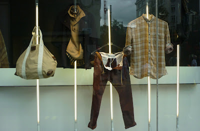
I love the visual presentation of this campaign with the product displayed on tube shaped lights that extend from the floor to the ceiling of the window. Without the detail and composition of mannequins it strips the display back and keeps your eye focused on the product. The text is a short one liner slogan simialr to those of French Connections previous two campaigns.. (Scroll down to February post to re-jog your memory!) I like the way they have used a similar format from previous campaigns and given it a new spin, making it instantly recognisable to the brand. I just hope they don't get too comfortable but continue to bring out new ideas that surprise and excite the customer!

Wednesday, 27 July 2011

John Lewis spell it out


This set of windows at department store John Lewis is a really strong example of how text can can be used with merchandise to create a clear and visually exciting message. By using a range of products to help write each word for the relevant department, for example 'dine' for their china and glass department, they add humour and interest to an otherwise very minimalistic display. By keeping the colour palette to mainly black and white they allow the text and products to create the impact. Informing passers by of the departments and products available in John Lewis!

Sunday, 29 May 2011

Bright Lights at Kurt Geiger


Kurt Geiger have taken this seasons neon brights and created a simple yet high impact display that draws your eye to another collection of their amazing shoes. Faced with one of the hardest types of product to merchandise in my opinion, Kurt Geiger have created a scheme that is very bold with the contrast of neon brights and stark white whilst maintaining a slick feel that embodies the brands image. I love this scheme and think it is the perfect display for this season.

Saturday, 30 April 2011

A Right Royal Do!

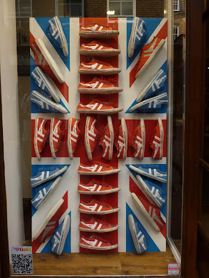
The most eligable man in England has tied the knot in what I thought was a fabulously traditional yet intimate ceremony yesterday. Wedding fever has swept across London over the last few weeks, and it seems like everyone is taking part in the celebrations! Here are my favorite windows dedicated to the royal wedding. In order of the photos, the stores are Liberty, Oasis, Urban Outfitters, Gola and John Lewis.


This was my contribution to our royal wedding meal, (they are meant to form a Union Jack..)