Wednesday, 15 May 2013

Selfridges Summer Commandments


From top to bottom, the festivals in each window are:
The Last Night of the Proms
Notting Hill Carnival
Wimbledon
Love Box
The Chelsea Flower Show
Royal Ascot

British summertime is not only defined by Pimms and rainy days but by the big events in the British summer calendar, the biggest of which Selfridges is celebrating in this campaign. Rather than just being a celebratory display though like last summer (see post in May 2012) the London department store are giving passers by style tips on what looks to wear to each event. A campaign they have titled "The Seasonal Commandments" Selfridges have taken the key trends for Spring Summer 2013 and styled a British summer event in each. My favorite collaborations are florals and the Chelsea Flower Show for its strong connection between event and trend and the geometric prints at the Last Night of the Proms for its striking monochrome product.

The format of each window is the same to create a strong visual campaign. Small props litter the floor of each window, from barbie dolls to tennis balls all holding mini placards with style tips for their event, a detail I love about the display and makes it a truly Selfridges campaign with their trademark humour and wit the brand are famous for.

Sunday, 10 June 2012

The Jubilee hits the shops

The Jubilee took over London last weekend, I don't think you could step onto a London street without catching sight of a union jack or a string of bunting. Every shop joined in the celebrations creating displays and visual delights fit for a Queen. The pictures above are a selection of my favourite displays. The first two pictures are from Hackett, I love the collage of pictures of the Queen showing her through the various years, the history really draws you in. The corgis with headscarves feature outside the Mulberry store in Selfridges, I love the little Queen-esque headscarves they have styled on the dogs. As you have probably worked out from the signage, the last two windows are from Jack Wills on the Kings Road.

Tuesday, 22 May 2012

What Brits do best at Selfridges

What do you think of when you say British? The Queen? Tea? The weather? Well all of the above and more featured in Selfridges British bonanza. Their current window campaign is perfect to celebrate everything British for a summer of events from the Queens Jubilee to the Olympics London 2012. Each window showcased a theme associated with Great Britain, the four I have shown here were my personal favorites! The seaside, tea, the weather and of course the British hugh street. What I like about this campaign is that in true Selfridges and British style they have injected a great sense of humour to each window! This is probably most apparent in the tea window, rather than showing an elegant afternoon tea Selfridges are showing a less elegant version of tea.. builders tea! Complete with a builders bum and giant sugar cubes as bricks, this window is full of a British sense of humour.

Monday, 27 February 2012

Levis go over the rainbow


A clever play on words can be a very powerful tool in marketing and promotion, look at the size and success of French Connections recent campaigns! So I was very excited when I saw this campaign for Levis on Regent Street. Coloured jeans in pastels and icecream shades are a wardrobe must-haves for Spring Summer. Every brand is shouting about their version including Gap who's current campaign is all around bright jeans. This campaign for Levis is definitely worth shouting about or blogging about should I say!

Levis coloured jeans in every colour of the rainbow are at the forefront of this campaign, but they are not alone. The curve they refer too is a play on words of the curve of a rainbow and the curve of a woman! A collection titled Curve is what Levis is promoting, designed by the jeans brand to celebrate the curves of a woman with three different fit jeans based on your body type.

The message in this display to me is the ultimate example of taking a trend and making it fit (literally..) your brands image and product, whilst really understanding your consumers needs.

Friday, 24 February 2012

Anthropologie get a paint job


This display at Anthropologie on Regent Street can't help but make you stop in your busy shopping tracks. The burst of colour and dramatic dripping paint design that covers the majority of the stores windows is big, bold and brilliant! The pastel colours, in particular the aqua, nod towards the key trends this Spring Summer with these sorbet shades looking to dominate the high street.

I like the fact that the two windows, one either side of the stores entrance, use different compositions for the paint drip design. The one dominating the majority of the window with a few cleverly placed gaps to showcase product and props. And the second, creating a window (within the window..) to show key outfits on a mannequin grouping.

Thursday, 16 February 2012

Mulberry are the flavour of the month


It may be ten below in London but that doesn't stop this display on Brompton Road look any less appealing! This summer inspired candy campaign from the British brand is right on the mark with this seasons candy colours and fun approach. The attention to detail on the giant icecreams is what prevents this campaign from looking cheap and tacky, the hundreds and thousands are my personal favourite, they look good enough to eat!

Friday, 18 November 2011

Selfridges are dreaming of a white Christmas


Christmas has officially arrived in retail and what better way to kick off the festive season here than with Selfridges. This year Selfridges have gone for a white winter Christmas theme, each of their windows depicting a Christmas related scene in a wash of white and silver sparkle. The attention to detail, use of scale, texture and lighting are what makes the all white display a success and looks particularly stunning at night. If you havn't been yet definitely get down to Oxford Street and feast your festive eyes on this gorgeous display! From cute polar bears to silver sequin stilettos there is something for everyone!

Wednesday, 28 September 2011

Topshop reflects the high street


I absolutely love this window in Topshop's Oxford Street Flagship store and under the beautiful clear blue skies of London today the reflective design looked incredible. A very simple concept, the window was made up of a row of mannequins on the floor styled in this seasons autumnal colours of magenta, mustard and oxblood. The mannequins on the floor were reflected in the mirrored surface of the backdrop so that to the passer by (or blogger in my case) you can see them perfectly as if they were stood up like in any other window..
As a brand that is ahead of the pack in delivering fashion to the high street it is great to see a creative concept that reflects (excuse the pun..) this.

Sunday, 11 September 2011

French Connection is the product


French Connection state on their website..


"Going forward we will present French Connection as a credible and focused fashion brand that speaks through its product."


This campaign does exactly that! In a tough economic climate it is more important than ever that retailers focus on having the right product for their customer. This campaign for French Connection is fantastic, especially with this in mind. It communicates to the customer about their product in a direct, humorous and visually exciting way.
I love the visual presentation of this campaign with the product displayed on tube shaped lights that extend from the floor to the ceiling of the window. Without the detail and composition of mannequins it strips the display back and keeps your eye focused on the product. The text is a short one liner slogan simialr to those of French Connections previous two campaigns.. (Scroll down to February post to re-jog your memory!) I like the way they have used a similar format from previous campaigns and given it a new spin, making it instantly recognisable to the brand. I just hope they don't get too comfortable but continue to bring out new ideas that surprise and excite the customer!

Wednesday, 27 July 2011

John Lewis spell it out


This set of windows at department store John Lewis is a really strong example of how text can can be used with merchandise to create a clear and visually exciting message. By using a range of products to help write each word for the relevant department, for example 'dine' for their china and glass department, they add humour and interest to an otherwise very minimalistic display. By keeping the colour palette to mainly black and white they allow the text and products to create the impact. Informing passers by of the departments and products available in John Lewis!

Sunday, 29 May 2011

Bright Lights at Kurt Geiger


Kurt Geiger have taken this seasons neon brights and created a simple yet high impact display that draws your eye to another collection of their amazing shoes. Faced with one of the hardest types of product to merchandise in my opinion, Kurt Geiger have created a scheme that is very bold with the contrast of neon brights and stark white whilst maintaining a slick feel that embodies the brands image. I love this scheme and think it is the perfect display for this season.

Saturday, 30 April 2011

A Right Royal Do!

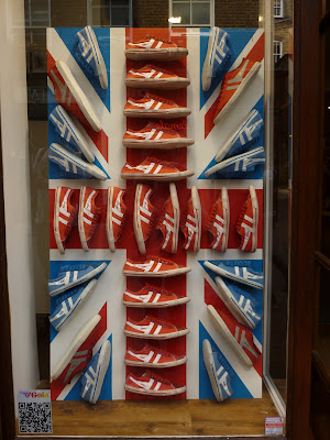
The most eligable man in England has tied the knot in what I thought was a fabulously traditional yet intimate ceremony yesterday. Wedding fever has swept across London over the last few weeks, and it seems like everyone is taking part in the celebrations! Here are my favorite windows dedicated to the royal wedding. In order of the photos, the stores are Liberty, Oasis, Urban Outfitters, Gola and John Lewis.


This was my contribution to our royal wedding meal, (they are meant to form a Union Jack..)